The Layout Control
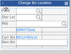
The Layout object is a parent control that helps keep child objects (i.e. labels, textboxes etc.) aligned when a prompt changes its size at run time. While the Layout control cannot receive focus, its child objects can.
In a Layout control, RFgen adjusts the widths of columns and heights of rows using the space available inside the control to calculate the alignment of objects. RFgen allocates the available space using these factors:
-
The number of columns and rows present
-
The contents of each cell
-
The property (or methods) assigned to each column or row
When assigning values, note that the Layout control’s overall width and height cannot be made larger or smaller by the Column and/or Row’s width/height values.
For example, if your application was translated from English into German and the text expanded 25%, the Layout control would automatically adjust the text and its adjacent controls’ position so they remain aligned to each other.
This auto-alignment feature saves development time creating separate layouts of an application that will be localized into different languages. It also saves the developer’s time positioning individual controls when the application is used on devices with small or large display areas. For example, if your device changes from a small to large screen the Layout control will also scale with the anchor points.
Layout Control Properties
(Name) - Sets the name of the Layout Control.
(SeqNo) - the sequence order number of the object on the app.
Anchor - Sets the coordinates of where a page is docked/anchored for screen sizing purposes. The points where this is anchored is important as this also increases or decreases the width and height of the Layout control and subsequent resizing of the objects inside the Layout control.
AutoSize - Sets whether the objects inside the Layout control will scale/resize.
- "(None)" - disables this feature.
- "Content" - expands the row (or cell) when the objects contained by the row expand or contract. For example, if the form is set to be translated, the Local = German, the longer text string in a Label could expand and push the TextBox on the same row further to the right, automatically. But if the Local = English, then the TextBox would move back closer to the Label so there isn't as large of a gap between the two.
- "Height" or "Width" - sets the AutoSizes only to the width or only to the height of the object in the Layout control.
BackGround - See the Graphical Control Properties.
Bevel - See the Graphical Control Properties.
BorderStyle - See the Graphical Control Properties.
Columns - Allows you to add, move, remove and stylize columns in the Manage Column Collections screen. For information on the (SizeMode), Margins, Value, and Visible, see the Manage Column Collection topic.
Columns: LinkedToPages - Available only if Layout is on the Form. This property enables the child object in the Layout control to be linked to the specified page. At runtime, the object is visible on the page its linked to.
DisplayMode - See the Graphical Control Properties.
Dock - See the Graphical Control Properties.
Events - If set to True, the selected event is enabled. The types are: AfterCellEdit, Click, ClickInLine, GotFocus, LostFocus, OnBackup, OnChar, OnEnter, OnFkey, OnKeyDown, OnMenu, OnRowColChange, OnRowColClick, OnScan, OnSearch, OnSwipe, and OnVocollect.
FullView - If set to True this helps you view all the history of entries in a Layout control if you have your Layout control setup to display breadcrumbs (i.e. linked controls to data entries) and need to see all the rows of the Layout control while in Design mode. It helps you get access to all your labels.
Keyboard - If you created special keyboards, use the property to select which keyboard would display in place of the one native to the device.
Location - Sets the location of the Layout control relative to the x,y coordinates of the screen.
Padding - See the Graphical Control Properties.
Rows - Allows you to add, move, remove and stylize columns in the Manage Rows Collections screen. For information on the (SizeMode), Margins, Value, and Visible, see the Manage Row Collections topic.
Rows: LinkedToPages - Available only if Layout is on the Form. This property enables the child object in the Layout control to be linked to the specified page. At runtime, the object is visible on the page its linked to.
Size - the tototal size of the grid in pixels.
Visible - True makes the layout control (dotted outline) visible in the Designer and at Runtime. False keeps it hidden in the Designer and at Runtime.
About Rows and Columns
When you add or remove columns or rows, the total count (collection count) of columns and rows are displays respectively in brackets { }.
The total amount equals the number of columns or rows set in the property group. The count is not affected by the settings in Configuration > Environment Properties > Item Collection is one-based. You can not assign names to the column or row.
Related Topics
See “How to use the Layout control” for more information.
For property descriptions, see Graphical Control Properties.